User-Centered Design & SEO Success:
Achieving Google High Ranking for High-Intent Searches, with Highly Relevant Content, Opens the Door to High Engagement
And yes it’s highly recommended, because it’s highly beneficial to any organization, business, or cause.
Let's unfold the details, shall we?
User Experience Design Project Overview
This project focused on designing a new website for a car detail business aiming to branch out into offering training courses and certification—something that’s rare in the area.
The goal was to create a site that adds value from the start, through a user-centered design process, catering to both beginners and experienced detailers, all while setting the stage for future content development.
Key UX Design Wins:
Early Engagement Features: I introduced a pre-registration form and a feedback survey to boost early interactions and engage users from the start.
User Benefits: These features let potential students provide input, helping shape courses that meet their needs.
Business Benefits: These features gave the business the opportunity to connect with clients early, gather insights, and measure demand—well before the official course launch.
Early SEO Success: Within just a week, the site showed up on the top 5 positions of Google’s page 1 organic results, meaning it ranked high for relevant search terms.
User-Centered Design: By using research-driven insights, the website’s structure, content, and messaging were created to meet users’ needs—which played a key role in achieving that early high ranking on Google.
This project shows how a well-designed user experience—guided by research to have highly relevant and engaging content, combined with strategic SEO and interactive features—can drive results, create immediate business impact, and set the stage for future growth.
My Role
User Experience Designer, Content Developer, and UI Designer
Expected Impact
The specialized skills training can open affordable career paths with minimal startup costs—ideal for those seeking a career change or an alternative to the traditional college route. It also offers flexible lifestyle opportunities for those aiming for better work-life balance. Additionally, it can create productive, profitable opportunities for young people, potentially steering some away from negative influences.
Get a Feel for the Experience: Explore the Prototype
Click the full-screen icon in the top-right corner of the desktop prototype to explore the design flow.
The next sections and pages will automatically appear every 5 seconds.
Press enter or click on the page to move to the next screen.
To jump to specific sections, click the "Learn More," "Sign Up," or "Get in Touch" buttons and links.
Note: Some elements—like dropdowns, text fields, and radio buttons—are for visual display only and are not interactive.
User Experience Design Approach
To build an effective website, this project followed a User Experience Design process, using User-Centered Design techniques to primarily design based on the needs of the people who would be using the site.
The goal was to get to the root of their needs, and have those insights shape the design, while also supporting the business’s goals.
The process breaks down into five key stages:
UX Design stages diagram created by the author
You can dive into the full story of each stage by clicking the links, or simply use the sticky menu in the bottom right of the screen to jump to any stage at any time.
I. Empathize
This stage is about understanding what users need, want, what they’re struggling with, and what motivates them. These insights help guide the design.
II. Define
Here, we figure out the core issues, clearly define the main problem to solve, and establish a clear direction for the design.
III. Ideate
This is the brainstorming stage—where ideas for possible solutions are formed.
IV. Prototype
We take those ideas and bring them to life in a way that users can actually interact with, turning the design into something real.
V. Test
We gather feedback, make tweaks, and refine the design.
Why UX Design Isn’t Always a Straight Path
To keep things simple, this case study shows the process in order. But in reality, User Experience Design isn’t always that straightforward. The process is flexible, and like in this project, you might loop back to earlier stages to improve the design as new insights come up.
Here's an example of how the UX design process can loop and flow—sometimes going back to earlier stages like Empathize, Define, and Ideate as new insights pop up.
UX Design loop diagram created by the author
Empathize
A deep dive into user research to uncover insights, build understanding, and develop empathy to address users’ pain points.
Research & Key Insights
Comprehensive research was done to make sure the design is driven by both user needs and business goals:
User research: Explored what motivates potential students to enroll, what kind of training they’re looking for, and the challenges they face.
Business context: Looked into the company’s branding and market positioning to ensure the design would align with the company’s goals and messaging.
-
Analyzed user-generated feedback from social media and forums to uncover customer needs, challenges, and frustrations.
Key Insights:
Hands-on, up-close training is key, especially when learning to use tools.
Smaller classes or one-on-one training are preferred for personalized feedback.
Learners want a clear understanding of the entire detailing process, which can be tricky with so many variables.
They aim to perfect techniques, ditch bad habits, and do things in the best way.
YouTube tutorials and forums can be confusing due to differing methods and product preferences.
-
Researched popular topics potential students search for when learning about car detailing to create content that answers their questions and boosts site visibility.
Key Insights:
Pinpointed the most relevant topics to guide content creation.
Combined with other research, this helped paint a clear picture of user behavior to shape UX design decisions.
-
Reviewed competitors to spot strengths, weaknesses, and standout features. This revealed industry practices, market gaps, and opportunities for a more user-focused solution.
Key Insights:
While general automotive maintenance training is common, specialized car detailing certification is a rare offering in LA. This agrees with what the business mentioned.
Many students voiced frustrations over lack of hands-on practice with major issues, instructors not following best practices, large class sizes, and schools pushing their own products over quality teaching.
What top detailing schools have in common:
Instructors are seen as experts with real-world experience, who mastered techniques, tools, products, and industry best practices.
Training is focused on skills, not product sales.
They offer flexible courses, from 1-day to 5-day "Master" courses, plus private options.
Websites are easy to navigate with clear, relevant info, credible details, simple sign-ups, and visible value.
Training pages include helpful background, relatable videos, diverse student stories, and strong testimonials.
While general automotive maintenance training is common, specialized car detailing certification is a rare offering in LA. This agrees with what the business mentioned.
-
Reviewed the business’ publicly available materials, including their Facebook page, business cards, brochures, and reviews to ensure the design of the training program aligned with the company’s brand and messaging.
Key insights:
The business's branding emphasizes their commitment to tackling any job, big or small, with a focus on delivering excellent results.
-
Started by asking about the business’s value proposition and competitive advantage, then engaged with the business owner to dive into his vision, motivations, and challenges as a car detailer.
Key insights:
Gleaned from the interview that the owner's real-world hands-on experience, scrappy mindset, ability to help future students minimize startup costs, and being able to support Spanish-speaking students, can serve as his school’s value proposition.
There was a mention of training individuals who now run their own businesses.
- Pictures, videos, and testimonies from those individuals were requested as they would serve as social proof.
-
Gathered pre-existing surveys to compile demographics information.
Also created a survey on the website to capture direct feedback from potential students to understand goals and challenges. Responses are not available at this time as the site is not live.
Key Insights from pre-existing surveys that informed the design and messaging of the site:
Most respondents of pre-existing surveys prefer short-term certification programs with flexible schedules to fit around their current jobs.
U.S. auto detailer demographics (Source: Zippia):
10.8% women, 89.2% men
Average age: 38
Majority are White (61.5%), followed by Hispanic/Latino (15.5%), Black/African American (12.7%), and Unknown (4.9%).
The top three states with the highest demand for auto detailers are California, Texas (especially Houston), and Florida, with California leading at over 13% of the national total.
User Personas
To keep design decisions user-centered, research and insights were brought to life through detailed user personas which you’ll see below. These fictional characters, not paid actors, add a human touch, representing the goals, needs, and motivations of the ideal users for the website and app.
Marco: Aspiring Car Detailer
Lifestyle and Aspirations
"A 4-year college is not for me. But with the right practical training and tools that do not break the bank, I know I can build my detailing business and make it work. I’m ready to hustle and learn quickly."
Demographics
25-year-old waiter
Single, no children
Lives in Los Angeles with his parents and two younger siblings, whom he helps support financially and care for
Has a low-income level
Went to some college
Goals and Needs
Marco wants to start his mobile car detailing business, but first, he needs an affordable, flexible training program to build his skills and stand out in a competitive market.
Challenges and Pain points
Marco is motivated to improve his life but faces several constraints. With a limited budget and only one weekend for hands-on training every few months, he finds everything expensive and overwhelming, unsure what’s worth his time.
Relevant Patterns of Behavior
Cost-Conscious: While on a tight budget, he values quality solutions that save him time.
Time Constrained: Always on the go—balancing work and driving his siblings—he needs training that’s quick and efficient.
Work Ethic: Despite being busy, he's dedicated to putting in the time to reach his goals, even if it means sacrificing personal time.
Overwhelmed by Options: Struggles to filter through the many training options available.
Hands-On Learner: He learns best by doing and values training he can apply right away.
Technology & Channel Usage: He's tech-savvy, often learning from forums and tutorials on his phone, while turning to his desktop for tasks that need extra care, like signing up for school.
Keith: Aspiring Exotic Car Detailer
Lifestyle and Aspirations
"I want more time with my family and control over my schedule. I’ve dabbled in car detailing and want to take it to the next level. While I’m open to local training, I think LA’s the place to be. I’m testing the waters to see if this business is worth pursuing before fully committing."
Demographics
36-year-old QA Engineer
Married with one child
Lives in Miami with his young family
Middle-level income
College graduate
Goals and Needs
Keith wants to work with his hands more and have work-life balance. He think that starting a part-time car detailing business specializing in high-end and exotic cars would be a good step in that direction, with plans to go full-time once it’s financially stable. He needs the right training and mentorship to make it happen.
Challenges and Pain points
Keith struggles with balancing his hectic schedule, including a demanding tech job and a young family. His focus is on establishing himself as an expert in exotic and luxury car detailing, requiring a strong mentorship program. Out-of-state training must be justifiable, with a clear return on time investment.
Relevant Patterns of Behavior
Family-Focused: His family is a key motivator, driving his desire for flexibility and more control over his time.
Time Constrained: He needs flexible, self-paced training that fits his busy life.
Work Ethic: He’s committed to quality work and careful about building his business while balancing his current job.
Financially Responsible: He is mindful of his family’s finances and seeks to invest wisely in training and business expenses. He’s open to flying to in-person classes if they’re worthwhile.
Visual & Practical Learner: He learns best visually and values practical training he can dive right into.
Technology & Channel Usage: He’s tech-savvy and regularly uses his smartphone and computer to access online resources, including tutorials and forums, to connect with mentors and stay updated on trends.
Define
To build a website that is effective and truly meets user needs, the design was guided by the user personas’ goals, motivations, pain points, and lessons gleaned from research. These insights shaped the core features, ensuring the website would be user-friendly, relevant, and effective in encouraging action — even in its early stages.
Goal I: Launch a Starter Website That Brings Value
The Minimum Viable Product (MVP) is a functional website that’s built with core features and placeholder content to set the stage for the new school while the training program is still in development.
Einstein said: “Try not to become a person of success, but rather try to become a person of value.”
I think we can apply that to sites too.
The MVP Included Realistic Placeholder Content
To serve as framework for future updates and give users a sneak peek of what’s to come, the following placeholder content (pictures, videos, and text) were developed.
Reasons for Starting a Detail Business
Benefits of Car Detailing
Benefits of Professional Training
Business Value Proposition
Frequently Asked Questions
Instructors’ Pictures & Background
Course Information
What to Expect in Class
Class Video Previews
Car Detailing Tips
Sample Student Reviews
Sample Placeholder Content on the Home Page
These were to guide future content updates and provide users with helpful insights early on:
Proactive Steps for Early Engagement
With no set date for real content, adding a pre-registration form and survey opened up early engagement opportunities.
Sample Early Engagement Features: Pre-registration & Survey
With effectively placed call-to-actions and links throughout the site, these features prompt users to sign up in a natural and conversational way:
Capturing Early User Feedback & Measuring Demand
UX Design Highlights
By offering helpful content and interactive features right from the start—like a pre-registration form and feedback survey—the site delivered value early and:
Created opportunities for early user engagement, to let potential students express interest, share their goals, and provide insights into their challenges, helping shape courses that meet their needs.
Enabled the business to gather insights to shape future offerings
Made it possible to gauge student demand through survey responses
Opened the door to build excitement for the official launch
Goal II: User-Centered Design with SEO
Designing with Users in Mind
To ensure the website’s structure was optimized for search engines (SEO) and content aligned with what users were actively searching for, a user-centered design approach was used.
Comprehensive user research and detailed personas brought to light user intent, what features mattered most to users, and how to present them. By using these insights to shape user stories (shown below) that defined the essential features, we can confidently say that following aligned with users’ needs and expectations:
site's design
site structure
messaging
Story maps then outlined where it makes sense for these features fit in the user flow — covering the two key features: self-paced online learning and hands-on practical training.
This approach didn’t just create a smooth, seamless user experience, it also played a huge role in driving impressive results for SEO. Discover how this strong connection impacted the site’s visibility in Google search results.
Story Maps for User-Centered Design
These user stories define the essential features users expect, like modular learning paths, practical learning registration, helping ensure the product’s user-centered design.
MVP Essential Features
Content Framework: Placeholders for the business to upload real content (pictures, videos, text) so students can have a preview.
Easy course exploration: A clear way for students to browse upcoming courses and workshops, plus schedules when they’re set.
Pre-registration form: Allows users to sign up early.
Survey and Feedback Form: Encourages users to provide input to help shape future classes, ensuring they meet real needs.
Contact form: Gives users an efficient way to send messages.
Intuitive navigation: Helps users quickly find what they need.
Payment system: Built in, ready to support future transactions, but hidden at this time.
Responsive design: Site to work for both desktop and mobile
Search Engine Visibility: For SEO impact, rank between page 2 and 5 for long tail keywords within the first 3 months
Success Metrics and Acceptance Criteria
To measure the project’s success and confirm everything worked as intended, the following criteria were set.
Success Criteria 1: Functional MVP
The MVP was considered complete and successful once users could intuitively navigate the site, the following features work, and they’re easy for users to use.
Explore course details and access the scheduling feature
Pre-register for classes; also signs up users for updates
Fill out the survey
Fill out the contact form
Success Criteria 2: User-Centered Design
By building the MVP website with key features defined in user stories that are aligned with insights from research and user personas, this approach ensured the website would be user-friendly, relevant, and effective — even in its early stages.
Success Criteria 3: Mobile-Friendly Design
The site should look and work great for both desktop and mobile.
Success Criteria 4: SEO Momentum - Building Search Engine Ranking
Since the process of improving a website to rank higher on search engines (SEO) like Google, is an ongoing and long-term effort, clarifying what would be a realistic expecation is important here.
As you might expect, it’s rare for a newly launched website to appear on page 1 or achieve impressive results early on for popular search terms that many businesses are also targeting. Even though it’s possible, as this case study shows, it’s not the norm. More on that shortly.
So for the first three months, success is about achievable milestones—building a solid foundation for better rankings and traffic over time.
Here's what that short-term success might look like:
Ranking for Branded Searches: The website appears on the first page for searches that include the brand name, e.g. [Business Name] car detailing training".
Gaining visibility (Page 2 to Page 5) for non-branded niche search terms: Achieving visibility for niche, high-intent phrases that reflect the site's content (e.g., "car detailing training program in [city]").
Impressions Growth: A steady increase in search impressions (how often the site appears in search results), even if clicks are still low.
User-Centered Design and SEO Success
Proven Results: High Ranking for High-Intent Searches
One major success was having the website rank between 1st and 5th position on Google’s Page 1 for key phrases like "car detail training in Los Angeles" — all within a week of launching.
Typically, ranking for a moderately competitive term like this takes 1-6 months.
This result wasn’t just luck — with no paid ads, backlinks, or external links yet, it was achieved by carefully matching search intent and applying effective user-centered design.
By answering real questions potential students were searching for, the site became highly relevant, making it easy for those actively seeking car detail training to find it.
This SEO win gave the business a head start in attracting interest even before their training program officially launched.
SEO Strategy Success
Non-branded terms ranked high on Google within a week of launch
Using the phrase: “Los Angeles car detail training” to search resulted in the business appearing on the top 5 organic search results (following sponsored or paid listings) on page 1 of Google.
How This Benefits Any Business or Organization
Using the phrase: “Southern California detail training” to search on Google resulted in the business appearing on position #1 of the organic search results listed on page 1 of Google (below sponsored or paid listings).
The website achieved Page 1 rankings (between 1st and 5th position) on Google’s organic search results — by having its structure, messaging, and features closely aligned with what users were actively searching for.
The site successfully capturing early Google visibility means opportunities for easy discovery and early engagement of high-intent users.
Page 1 of Google’s Results - Full Page View
Organic traffic drives conversions and growth
Why were the results a big win? First of all, a few numbers on how much traffic organic traffic generates, the significance, and what can be gained from that traffic.
Organic search’s share of traffic, compared to other channels, is a whopping 53.3% on average across industries.
Organic traffic accounts for over 40% of revenue across Retail, Media & Entertainment, Business Services, Technology/Internet, and Hospitality.
Most users stick to the first page of Google search results, so businesses that land on that page get the lion's share of clicks.
More Clicks from Top Spots: The first few search results get the most attention. On average, the #1 spot grabs over 20% of clicks — far more than lower positions. See the average click-through rates for desktop and mobile below.
The top positions capture a disproportionately higher share of traffic.
Graph Source: Semrush
So landing on Google’s first page is very beneficial as it gets you in front of people actively searching for what you offer. While the top spots get the most clicks, even lower positions can still drive valuable traffic.
Ranking high on Google isn’t just about showing up — it’s about connecting with people actively searching for what you offer. Here's why it makes a big impact:
High-Quality Traffic: People searching for specific solutions are often ready to take action (high-intent visitors) , whether that’s booking a service, subscribing, or reaching out.
Trust and Credibility: Appearing at the top signals reliability, helping you stand out as a trusted choice.
Steady Flow of Visitors: Unlike paid ads that stop the moment your budget does, strong SEO keeps working in the background, driving consistent traffic over time.
Early Interest for Future Growth: Even before your full offering is available, ranking high can attract attention, build excitement and momentum, which allows you to start building a community or leads, and lets you gather insights from potential customers.
By investing in SEO, businesses create lasting opportunities to connect with the right people at the right time — to drive sustainable growth without relying heavily on paid ads.
Ideate
Exploring Solutions for an Engaging, User-Centered Design
With clear goals defined and key features outlined, I explored ways to create a site that felt inviting, intuitive, and encouraged early engagement.
I. Target Audience
Since users are the design’s main driver, it’s worth noting here that the content strategy was designed to connect with two key group of users with different experience levels and needs:
Beginners who are new to detailing
Experienced professionals who want to advance their skills
It also addressed users with different levels of readiness in making a decision:
High-intent users ready to take action
Low-intent users still exploring their options
Remember these guys?
They guided content design and UX writing for beginner and experienced users, which tremendously helped not to miss the mark.
Beginner User
Experienced User
II. Business Content Goals
Build brand awareness with SEO to attract traffic
Drive leads and sign ups through pre-registration, survey, and contact forms
III. Content Creation Strategy
I defined a user-centered content strategy focused on keeping information relevant, engaging, effective, and easy to digest. It answered key questions upfront — helping users quickly see if the training program was worth their time, what to expect, and what the courses offer (like flexible learning options) — without feeling overwhelmed.
Approaches:
Relevant content was effectively placed upfront so key details are easily accessed
Efficient user flow through flexibility and time-saving features for busy schedules
Simplified user flow — created an intuitive path from exploring to taking action
Conversion-focused design to encourage and guide users in taking action
Interactive features to boost engagement and gather insights
Mobile-friendly design for a great experience in both desktop and mobile
Look and feel — bringing personality to the design
Easy-to-scan relevant content was effectively placed upfront
To provide value early on and save time for users, important information that users need to know right away was presented in an upfront and straightforward way.
Streamlined content design and UX writing made information quick to grasp — no rabbit holes or wild goose chases here!
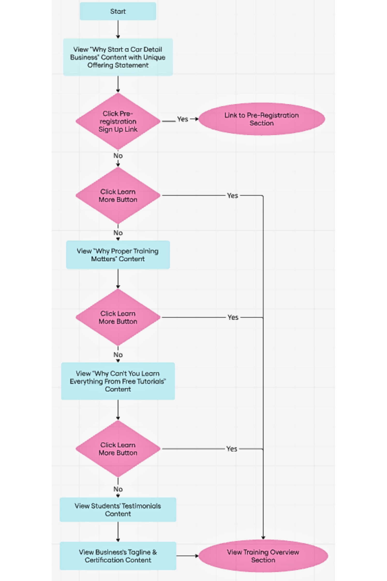
The structure prioritized essential details first, followed by deeper insights for those seeking more information. This user flow highlights how content help both high-intent and low-intent users find what they need quickly.
Users’ questions that needed to be answered immediately were positioned upfront in an engaging way.
Reasons for Starting a Detail Business with Business Value Proposition
Benefits of Detailing & Proper Training
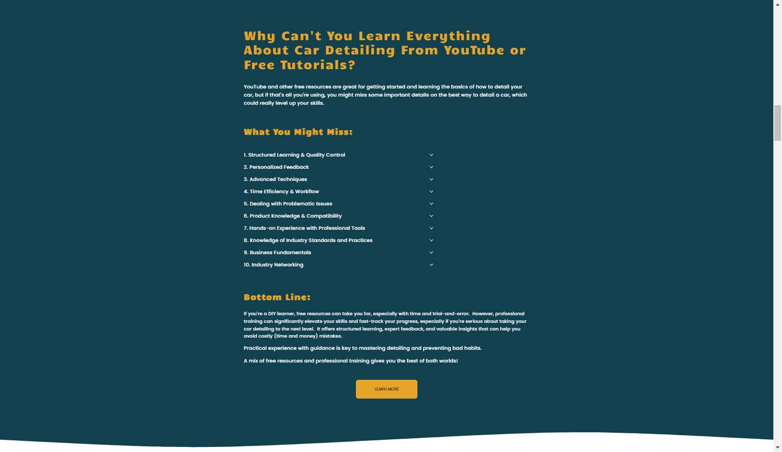
Why Learning from Free Tutorials Need to be Combined with Structured Professional Training
Social Proof through Testimonials
Business Credibility, Values, and Certification
Strategic Call-to-action Placement for Natural Engagement
Call-to-actions like "Learn More" and "Sign Up Now" were placed in spots that feel natural and following informative content to address different timing of readiness — to guide users toward taking action without feeling pressured.
2. Flexibility and Time-saving Features for Students’ Busy Schedules
Content:
Online courses for foundational knowledge, including modular self-paced courses for flexible learning
In-person workshops for hands-on skill building, with multiple schedule options for added convenience
Clear separation between online courses and in-person workshops to help users quickly find what fits their needs
Easy course exploration: Provides a clear way for students to browse upcoming courses and workshops, plus schedules when they’re set.
3. Simplified User Flow — Created a clear, easy path from exploring to taking action with intuitive navigation
Content:
Brief class overviews that provided enough detail without feeling overwhelming
Drill-down features to explore deeper details only if students wanted to
The intuitive menu design ensured pages like "Contact Us" were always easy to find
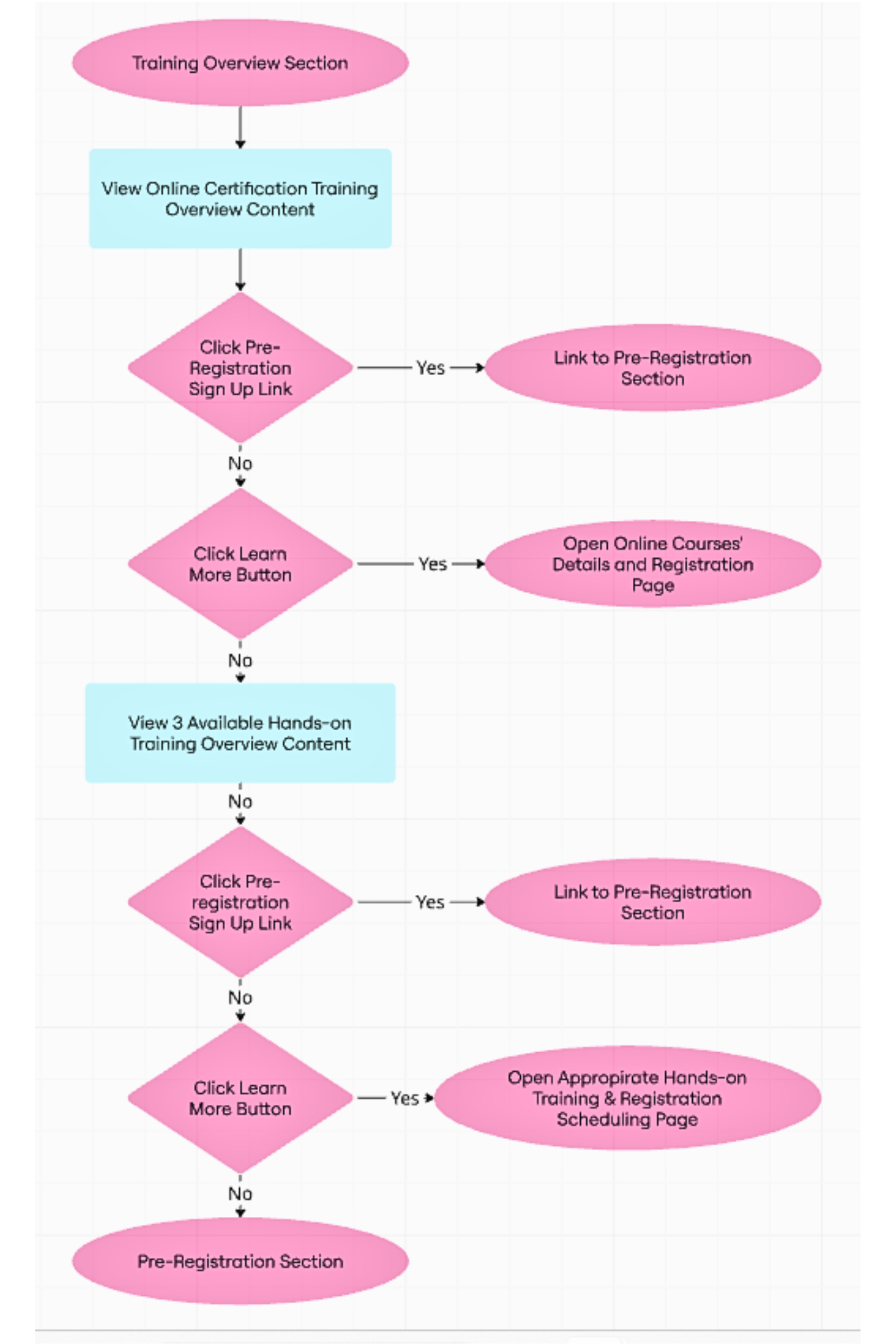
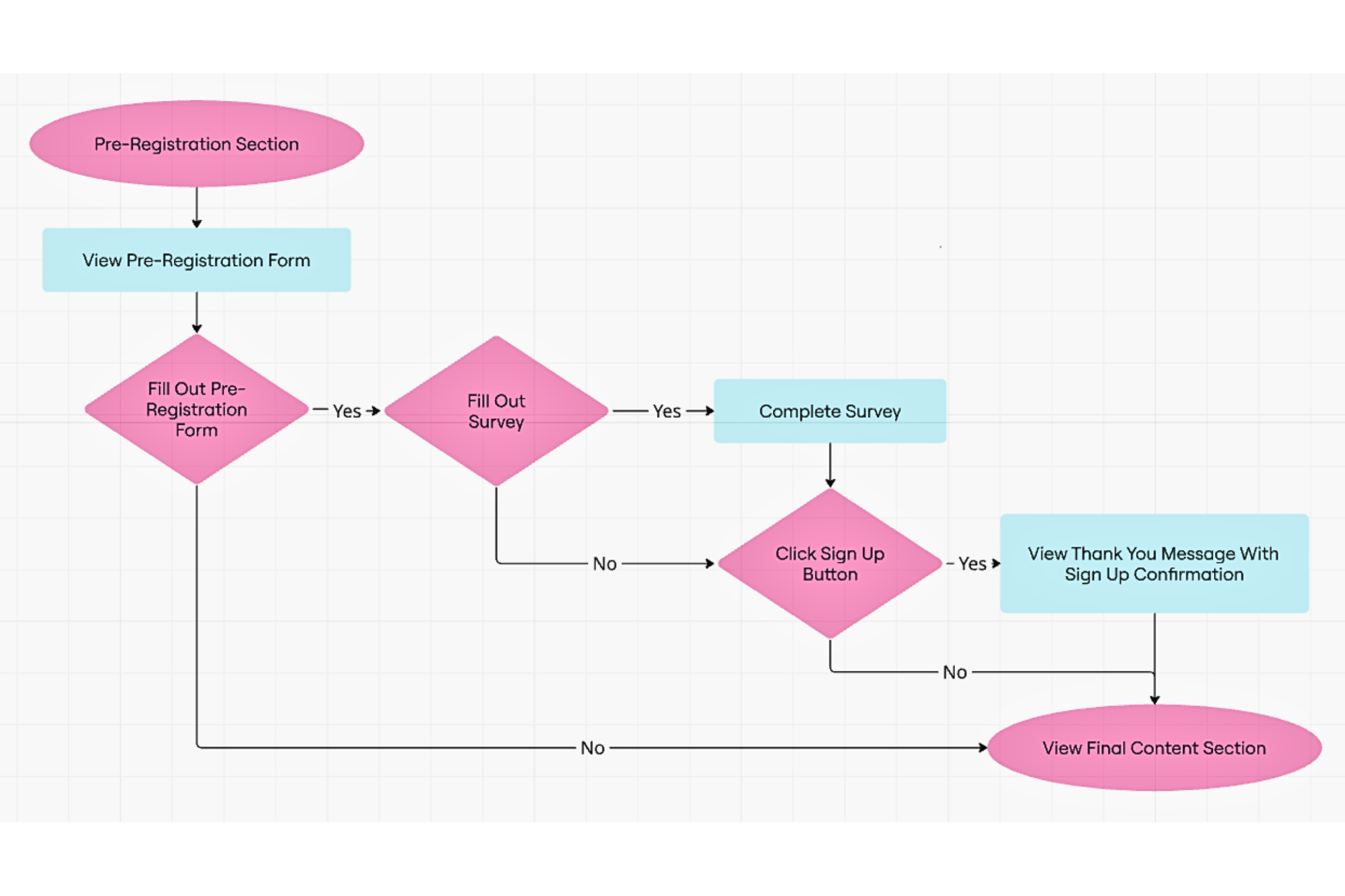
Catered to user intent: This flowchart highlights the clear path designed for visitors — guiding both users who are just exploring (low-intent users) and those ready to take action (high-intent users).
Organized Content for Easy Browsing
By grouping online courses and in-person workshops separately, visitors can quickly see what suits their needs. This clear structure helps users make faster decisions, improving their overall web experience.
4. Conversion-focused design that encouraged action
The design encouraged key actions like:
Pre-registration sign-ups
Contact form submissions
Learn more
By offering multiple entry points to the pre-registration form, users could engage when they were ready, improving the overall experience.
To encourage action in an engaging way:
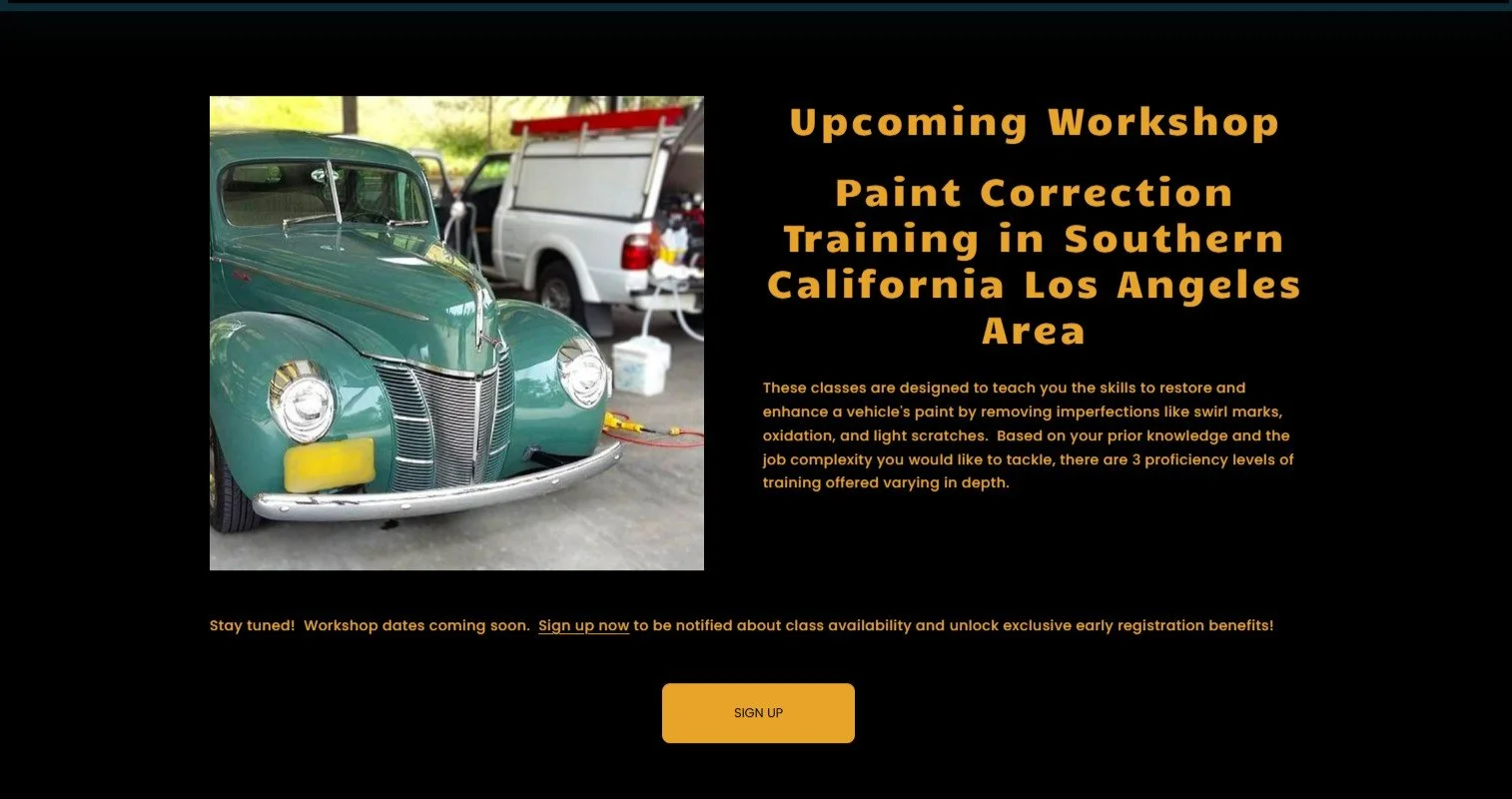
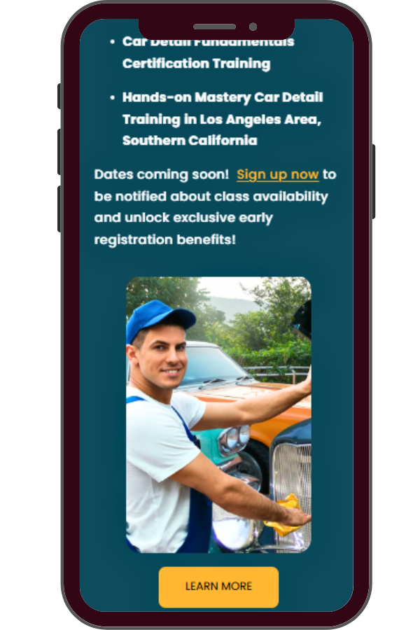
CTAs like "Sign up now" invited users to get notified about class availability and unlock exclusive early registration benefits.
CTAs like "Learn more" guided users to explore course overviews and detailed information.
These CTAs were placed in natural, strategic spots throughout the site — following clear, informative content — to guide users without pressure and provide plenty of opportunities to take action.
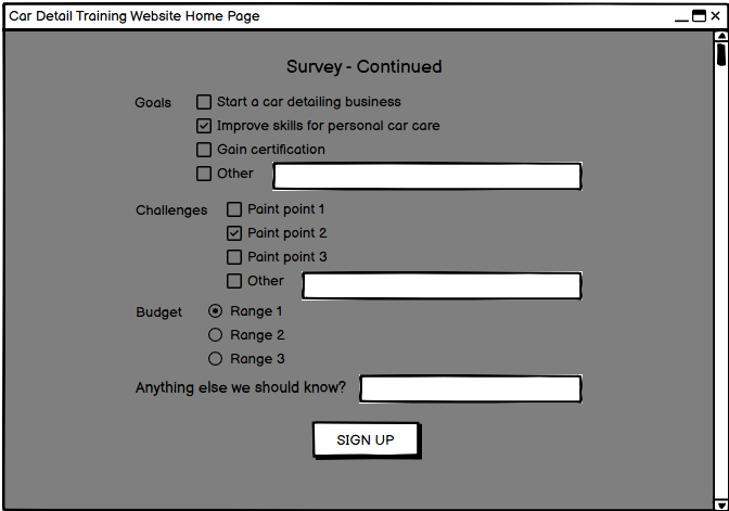
Early Engagement Through Feedback
This interactive survey was designed to encourage potential students to share their interests and goals. By involving users early on, the business can tailor its offerings while boosting user engagement.
The Pre-Registration Feature Gave the Business the Opportunity to Gauge Demand before the training program is fully developed. This should be valuable in finding out the volume of interested students.
"Designing with user intent in mind ensured the site delivered both early engagement opportunities and a clear path for action — from exploring course options to signing up."
5. Interactive Features to boost engagement and gather insights
Pre-registration form and survey to connect with users and shape future offerings
Video previews to showcase course content and give visitors a sneak peek
Content strategy using interactive video content - this along with concise course information on what to expect, gives students relevant upfront information.
Class module video previews with a related static image.
Class module video preview on exterior detailing.
Class module video preview on interior detailing
Class module video preview on engine detailing.
Class module video preview on running a successful detail business.
Class module video preview on troubleshooting.
Class module video preview on the certification.
6. Mobile-friendly Design for a great experience in both desktop and mobile
Formatting was tailored for mobile devices.
Features like easy scannability, concise content, and section jump links help mobile users quickly access information.
7. Look and Feel: Bringing Personality to the Design
Typography — Picked a clean, bold font that’s easy to read and fits the brand’s growing personality — strong yet approachable, like a firm handshake with a warm smile.
Imagery Style — Created and curated visuals that align with the brand’s evolving identity, adding a splash of personality without overwhelming the content.
Clean Layout — Designed a clear, organized layout — no maze-running required!
Visual Hierarchy — Made key content pop so users can find what they need at a glance — because no one enjoys playing hide-and-seek with important info.
Color Palette — Chose teal blue and yellow ochre for a fresh, inviting vibe that’s easy on the eyes, stands out from the crowd, and keeps things visually appealing and effective.
Why These Colors?
Teal Blue — Pulled from the business card to keep branding consistent. It’s cool, calming, and trustworthy — like a breath of ocean air, perfect for a Southern California-inspired brand.
Yellow Ochre — Adds warmth and energy — like a splash of California sunshine. It’s bold enough to grab attention yet soft enough to keep things easy on the eyes — a win-win!
Breaking the Mold
Instead of the usual red-and-black or black-and-white combos, this color duo offers a fresh look that feels inviting, vibrant, and dependable.
Plus, with so many users glued to screens, these softer tones help reduce eye fatigue, making the experience more enjoyable — and easy on the eyes, literally.
Prototype
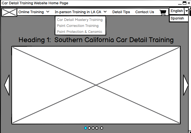
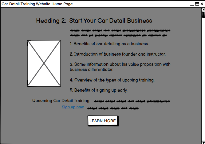
Below is the low-fidelity prototype, where ideas started taking shape. The high-fidelity prototype, showcasing the final look and feel, appears earlier in this case study after the overview.
TEST
Testing focused on internal reviews and early-stage feedback to ensure the website was functional, responsive, and engaging.
Mobile Responsiveness
The site provided a smooth, seamless experience on both desktop and mobile, ensuring usability across devices.
Here’s a look at the desktop and mobile snapshots of the course overviews.
Users can then explore class details and schedule workshops by clicking the 'Learn More' button.
2. Functionality
Key features—like pre-registration, course details, and feedback surveys—were tested for usability and ease of access, ensuring a seamless user experience.
Below are desktop snapshots showing the pre-registration and survey forms in action, along with the confirmation page that appears after submission.
3. User Engagement Metrics Impact from Content Relevance and Engagement Features
The website was designed with engaging, relevant content and features as part of the strategy to boost Google rankings (for brand awareness) and encourage interactions (for lead generation).
While most clicks came from my internal testing, the results indicated the strategies were on track. The content aligned with what users would likely search for, making the site easy to find. If more content were added over time, these results could continue to improve.
Impressions, Clicks, and Click-Through Rates (CTR)
The graph shows how the site appeared in Google search results and how well links led users to the site.
Graph showing the site’s visibility in Google search results and the impact of internal testing on click-through rates (CTR) and user engagement metrics
4. Early SEO Success
Despite being online for only a short time, the site quickly ranked for target keywords, showing the effectiveness of the SEO strategy in boosting visibility. Ranking in the top 5 on Google’s first page—and even hitting position 1—was a major win for a brand-new site with mostly placeholder content. It’s a clear sign that the SEO foundation was solid from the start.
Using the phrase: “Southern California car detail training” to search (using a mobile device) resulted in the business appearing on one of the top 5 organic search results on page 1 of Google.
Proven Results with UX Design and SEO in a Short Timeframe
While the site’s online time was brief, it showed successful testing and strong early results. Due to unforeseen circumstances, the website was taken down after a month. However, during that time, the UI/UX design and key features performed well, achieving a high ranking on Google—proving the effectiveness of both the SEO strategy and user-centered design.
User-Centered UX Design and SEO Strategy: Driving Visibility and Early Engagement
By combining user-centered design, research-driven insights, strategic SEO, and conversion-focused features, this project created a website that ranked high on Google and opened valuable opportunities for the business.
Within a week, the site appeared in the top 5 search results for key terms—thanks to content that aligned closely with what users were searching for. This should help the business gain early visibility in their new niche.
Features like pre-registration and feedback surveys also gave the business opportunities to connect with potential students early, gauge interest, and gather insights to shape their training courses—all before the official launch.


